


Introduction
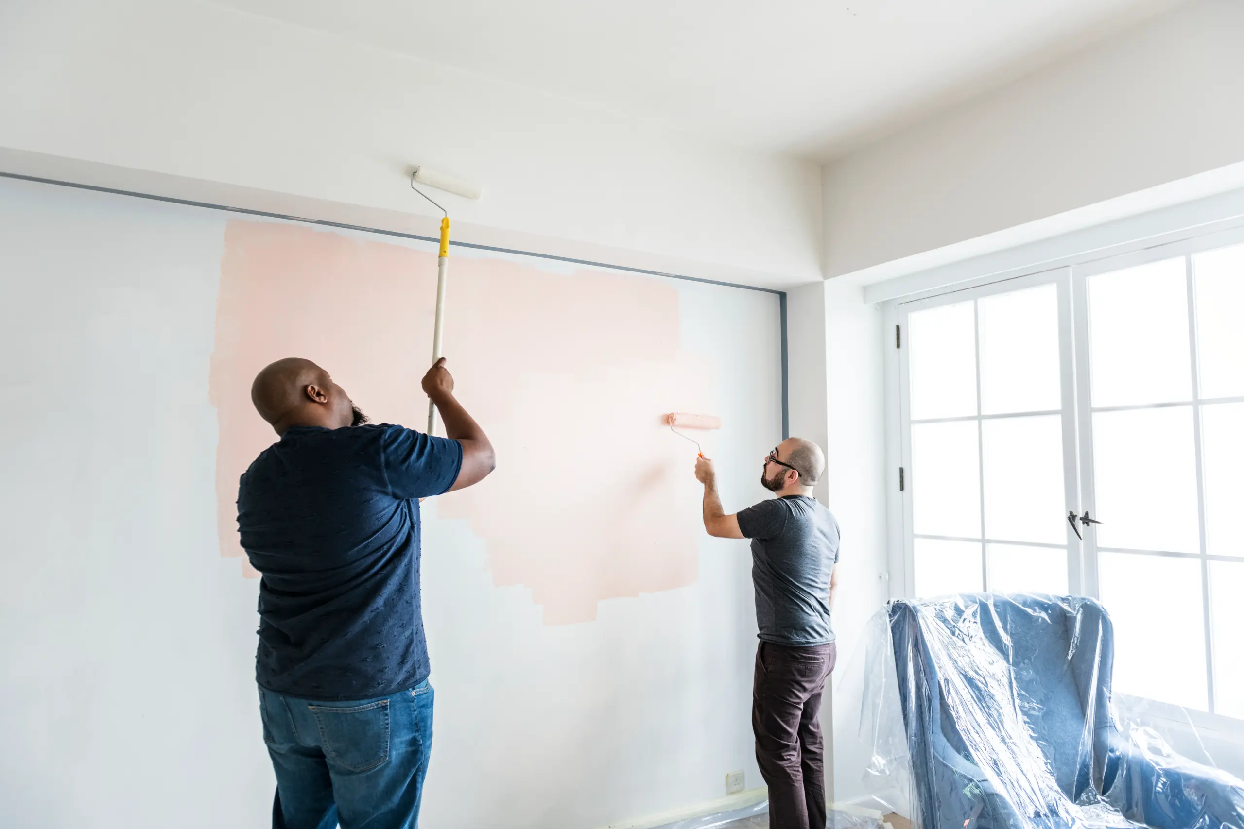
Choosing colors for wall painting can be daunting. To pick the right color, consider your room’s size and purpose. Take into account the natural and artificial lighting and the existing decor. Consult color psychology and gather inspiration from nature or use the colors in your current decor, artwork or furniture. Consider the 60-30-10 rule to help balance the overall color scheme. Test the samples and use different shades from the same family to create flows. Many paint companies offer virtual room visualizer tools to digitally preview paint options in your space.
The Ultimate Guide to Picking the Right Wall Color For Your Home
Do you know that paint colors can impact the mood, energy levels and perception of your space? Choosing the right paint color can be stressful. Homeowners often feel worried about making a mistake or choosing a shade that will quickly go out of style. Your home reflects your personality and supports your well-being. If you want to know how to choose the right colors, consult our guide below and create a harmonious space.
| Did you know?Moving away from gray and neutrals with cool undertones, US wall painting color trends for 2026 favor warm neutrals, earthy greens (olive, sage and dill) and rich, moody tones. |
Here is your guide to choosing the right wall colors confidently.
- Consider Your Room’s Function and Size
Lighter colors open up space and create welcoming vibes while darker shades suit larger rooms. Consider your room’s size and what type of feeling you want to create.
- Consider the Natural and Artificial Lights
Different light sources can impact your colors. Avoid choosing colors in the store’s light. Choose darker colors for north-facing rooms and vibrant hues for south-facing rooms. East-facing rooms are warm in the morning while west-facing rooms are intense in the afternoons. Pick your colors carefully to create the right ambiance.
- Consult Color Psychology
For energetic vibes in playrooms, choose bold, bright colors of wall painting. Greens create a tranquil environment and are ideal for bedrooms. Warm colors like yellows and oranges evoke happiness and stimulate conversation and can suit a kitchen environment. Blues offer serenity and are ideal for bathrooms.
| Fast FactMatte and flat finishes hide imperfections but are harder to clean. Semi-gloss or gloss are easier to wipe stains and ideal for doors, trims, cabinets and high moisture areas, while satin finishes offer durability with a subtle sheen and are ideal for kitchens and bathrooms. |
- Take into Account Existing Decor
Look at your furniture, rugs and curtains and identify their shades and undertones. Your wall painting should have the same undertones as your furnishings to create balance and a harmonious feel. Opt for lighter wall shades if your furniture is mostly dark. Choose deeper shades to add drama and definition if the furnishings are lighter in tone.
- Gather Inspiration
Pull colors from your favourite wall art, throw pillow, or rug. Consider the color of furniture, flooring, and fireplaces. Choose colors that complement the undertones of these features. You can observe nature for inspiration, browse interior design websites and magazines and use online color visualizers to understand how different hues work together.
- Build Your Palette
Consider the 60-30-10 rule to create harmony in your space. Using a 60% dominant color (for walls), 30% secondary color (furniture and curtains) and 10% accent tones (for accessories and artwork) helps create a balance and visual interest in your space.
Choose shades of one color to create flow in your space and help connect spaces. Use a single neutral color for all doors and trims.
| Important fact Choosing the right wall painting colors can impact mood, mental health and offer therapeutic benefits. |
- Test the Samples
Test a swatch of paint in your room and view it at different times of the day in different lighting. Observing the paint samples under various conditions and bulbs helps you see how they truly look to make the right decision.
Conclusion
Choosing the right color for your wall painting is more than simply following design trends or selecting shades that appear attractive in a catalog. It is a creative decision that has the power to influence the atmosphere of your home, the mood of the people living in it, and the overall personality of the space. Wall colors play a significant role in interior design because they create the visual foundation of every room. When chosen thoughtfully, they can transform an ordinary room into a comfortable, welcoming, and visually balanced environment that reflects your personal style.
One of the most important things to understand when selecting wall colors is that the choice should represent your personality and lifestyle. Every color carries a different emotional effect. Soft and neutral tones often create a calm and relaxing atmosphere, making them ideal for bedrooms and living spaces where comfort is the priority. On the other hand, vibrant and bold colors can bring energy and creativity into a room, which may work well in areas like home offices, playrooms, or accent wall painting. The key is to think about how you want to feel when you enter the room and choose colors that support that feeling.
Another important factor to consider is the purpose of the room. Different spaces in a home serve different functions, and the color palette should support those activities. For example, kitchens often benefit from warm and inviting tones that encourage conversation and activity, while bathrooms may feel more refreshing with lighter, cleaner colors. Living rooms usually work best with colors that create a balance between comfort and style, helping guests feel welcome while maintaining an elegant appearance.
FAQs
What is the 80/20 color palette rule when painting a room?
The 80/20 color palette rule offers a room design guideline suggesting to use one color palette for 80% of the area in a room and complementing it with 20% of a contrasting scheme to create balance and harmony.
Which wall painting colors are trending these days?
For living rooms, soft olive greens and warm clay beige are in, burnt mustard yellow is common in kitchens, while sapphire blue and charcoal slate are trending in dining areas.
Do wall colors improve home value?
Yes, neutral colors such as off-whites, soft grays, beige, and light taupes make your space look larger and welcoming, appeal to awide range of homebuyers and help boost your home’s value.